Embedded here is a collage of the clothes that we are planning for our main character to wear when we film our horror. I have created this using a website called Polyvore, to denote what group member Amy will wear during filming. We chose for her to wear a costume that accurately represents her conventionally as a young teenage girl. The clothes are all dark, as this connotes that the the character is not going somewhere safe, as darkness is associated with danger. Also the clothing in itself is typical conventional for teenagers, for example, leggings are often seen on teenagers and therefore leggings are some iconography related to teenage girls. The clothes are however, quite practical, which suggests that should our character come across danger she will be able to put up some kind of defence. This subverts stereotypes, as usually females in horror films are dressed impractically, which adds to the idea that they are a 'Damsel in Distress' and they need to be saved. As our character is not represented as though she is particularly vulnerable, this may create an enigma, as the audience are unsure as to whether this will be a stereotypical horror film, making our horror more enticing.
I have created an album of pictures from Bentley Priory, a nature reserve where we would like to do some filming, using a website called FlipSnack. This location is ideal for the filming of a horror film as the location is isolated, quite darkly lit, and very quiet. This means that we will be able to create an opening to a horror film, that complies with many of the conventions, as many of the conventions include an isolated place, that offers minimal salvation. For example; 'Cabin In The Woods' has a dark, isolated setting.
To create our own Idents, as a group we came up with a storyboard to follow so that we could consider how our Idents will appear on screen. Creating a storyboard helped us to decide whether our ideas will be realistic or if they will look professionally done. Below are pictures of the storyboard we created for our Idents.
Final Idents: Above is the Ident that we created for our final project, we created two Idents using Final Cut Pro, as we decided that it was more conventional of horror movies to use two Idents. The first Ident is a more generic one, that is a presentation of the larger production company, and the second Ident is one that is subject to horror films, perhaps a company that only produces horror film. First Ident: The first, more generic Ident makes use of clouds, as this seems to be a convention in Idents, for example Lionsgate, Dreamworks, Paramount, TriStar and Columbia all use clouds and skies in their Idents. This is because clouds have connotations of holding water, similar to the eye, which implies that these films will provoke an emotional response from the audiences.
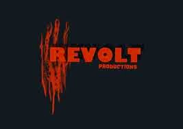
Second Ident: Our second Ident is subject to horror films. The title of 'Eerie Entertainment' should suggest that this is a smaller production company, that specialises in horror films, also the Ident makes use of a black and red colour scheme, which has the connotations of blood, darkness and horror. This is conventional of horror films, because it can also be seen in other smaller production company's Idents to horror films. For example; 'Revolt' and 'Red Letter'.
The footage, and soundtracks used for our Idents were taken from a copyright free and royalty free website called Footage Crate/Sound Crate.
Today's task was to look at Idents in more detail. An Ident is something that identifies film production companies, and they're usually shown at the beginning of the film. An Ident may be used to introduce the genre of the film, and create an image of the mood of the film. Idents may be used to add to the 'Cinema Experience' as in cinemas Idents are indicative that the film is starting, and it builds the dramatic tension before the film. We have looked into some production companies and looked at their Idents that are quite well known. In some detail we have looked at 'Lionsgate' and 'Dreamworks'. We have chosen to look at these as they are from generally different genres, so the similarities and differences are somewhat interesting. Lionsgate: Below is one out of the two Lionsgate Idents I will be looking at. Lionsgate are known for many horror films, and their Ident must reflect this, the embedded Ident is quite low key, the lighting is dark and the music begins slow paced, as it slowly creeps up and with this, so does the lighting. As it comes to an end, the music fades and the image with the font saying 'LIONSGATE' fades to black, leaving a serious impression on the audience. Design and Intention: The Ident is frequently used by Lionsgate, and it has a duration of 22 seconds. To begin with the Ident presents machinery, such as clogs and gears, connoting that similarly to machinery, 'Lionsgate' keep the film industry working and functioning. This may be due to their established name, and their reputation for a big production company. The camera zooms out of the clogs and gears as we pan out through the view of a keyhole, as the camera continues to zoom out. We soon see two quite prestige doors opening, which shows some lighter lighting, as we see the word 'Lionsgate' spread across clouds in a simple yet bold font, which reinforces the idea that 'Lionsgate' are a prestige as they images they have used have many connotations. For example, the doors 'opening up' could be indicative of the spectators minds as they are watching the film, being 'open' to a film that is a new experience to them. Also clouds have connotations of heaven, which may be suggestive of the high quality of the film that is to follow.
Another Ident that belongs to 'Lionsgate' that can be found is shown below; Design and Intention: This Ident is subject to films that are more to the genre of horror and gore. The colour scheme used is more dark and red, which connotes danger, blood, violence and slasher. This can be seen as a reflection of the genre. The opening is similar to the one above, with a close up of clogs and gears and panning and moving around them. However the cogs are more red and rusty than before, the doors also seen heavier and darker which again differs from the first. Similarly to the first Ident, this one lasts 22 seconds also. However as the doors open, the clods are deep red, and the font is black, with a hint of a rusty red. The font is still capital, so the image is still serious and dramatic, yet the collective image seems more subject to horror films. In contrast to the first Ident, the use of red clouds may connote hell as opposed to heaven. The doors used in this one are also less prestige, which again connotes that the film following may not be as lavish, as one perhaps following the previous Ident.
Dreamworks 'Dreamworks' are generally known for their films that are often animated and/or comedies. However 'Dreamworks' are known to be seen as the production companies to horror films such as "The Ring". Below is one of the two Idents I will be looking at from 'Dreamworks'.
Design and intention: This Ident lasts for 28 seconds, and is probably the most recognisable from the 'Dreamworks' Idents. The sequence denotes the reflection of a moon in water, which is soon interrupted by fishing bait in dropping into the water. As we pan up we go through the clouds and above them to the actual image of the moon with a young boy sitting in the curve of the moon, which soon turns into the curve on the 'D' at the beginning of Dreamworks. Throughout there is uplifting enchanting music, that helps to create the mood of the film. Then the camera pans to the right as we follow the word 'Dreamworks' through misty clouds. Finally there is a last shot of the word 'Dreamworks', quite zoomed out that is surrounded by clouds. The use of a child at the beginning of the Ident may connote that dreams are associated with children, creating a sense of nostalgia. Dreamworks may have chosen to do this, to make it seem as though their films are imaginative, as the colour scheme of blue and white is associated with clouds and the sky, and imaginative dreams and thoughts. Below is an Ident from 'Dreamworks' that was created for The Ring (2002). Design and intention : The design is somewhat similar to the previous one shown. The main differences being that this Ident is shorter, lasting for 21 seconds, also this one has a lack of music, there are small bursts of white noise, that matches the small bursts of static during the Ident, which matches the image of the film, as the film is based around a VCR that has static. This is useful for indicating the tone of the film, and giving the audience an insight as to what the film may be about. This research will be useful when it comes to the creation of our own Idents, as we will have a greater understanding of the ways in which an Ident can create the mood of a film, also the imagery used in the Idents can connote some of the themes that could be found in the film.