Final Idents:
Above is the Ident that we created for our final project, we created two Idents using Final Cut Pro, as we decided that it was more conventional of horror movies to use two Idents. The first Ident is a more generic one, that is a presentation of the larger production company, and the second Ident is one that is subject to horror films, perhaps a company that only produces horror film.
First Ident:
The first, more generic Ident makes use of clouds, as this seems to be a convention in Idents, for example Lionsgate, Dreamworks, Paramount, TriStar and Columbia all use clouds and skies in their Idents. This is because clouds have connotations of holding water, similar to the eye, which implies that these films will provoke an emotional response from the audiences.
Second Ident:
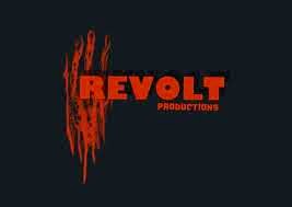
Our second Ident is subject to horror films. The title of 'Eerie Entertainment' should suggest that this is a smaller production company, that specialises in horror films, also the Ident makes use of a black and red colour scheme, which has the connotations of blood, darkness and horror. This is conventional of horror films, because it can also be seen in other smaller production company's Idents to horror films. For example; 'Revolt' and 'Red Letter'.

The footage, and soundtracks used for our Idents were taken from a copyright free and royalty free website called Footage Crate/Sound Crate.
Above is the Ident that we created for our final project, we created two Idents using Final Cut Pro, as we decided that it was more conventional of horror movies to use two Idents. The first Ident is a more generic one, that is a presentation of the larger production company, and the second Ident is one that is subject to horror films, perhaps a company that only produces horror film.
First Ident:
The first, more generic Ident makes use of clouds, as this seems to be a convention in Idents, for example Lionsgate, Dreamworks, Paramount, TriStar and Columbia all use clouds and skies in their Idents. This is because clouds have connotations of holding water, similar to the eye, which implies that these films will provoke an emotional response from the audiences.
Second Ident:
Our second Ident is subject to horror films. The title of 'Eerie Entertainment' should suggest that this is a smaller production company, that specialises in horror films, also the Ident makes use of a black and red colour scheme, which has the connotations of blood, darkness and horror. This is conventional of horror films, because it can also be seen in other smaller production company's Idents to horror films. For example; 'Revolt' and 'Red Letter'.

The footage, and soundtracks used for our Idents were taken from a copyright free and royalty free website called Footage Crate/Sound Crate.


.jpg)

No comments:
Post a Comment