Embedded below is my groups final titles. The roles we took included acting - by Amy Smith, and directing/producing - Simran Takhar and filming was done by myself.
Thursday, 27 March 2014
Thursday, 20 March 2014
Editing stage three
As we come to the end of our editing, little things must be added to create a good overall product, for example the credits had be added, it is key that we use a font that fits with the horror genre, and select a colour that fits in with conventional horror film colour schemes. Below are screen shots of our selection process in deciding what font we will use,
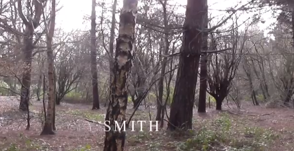
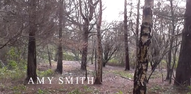

- The name of the titles that we decided looked the best is 'Feature' we chose this because the font fades in and out, leaving a eerie spooky atmosphere. Here we are placing it onto the footage and positioning it somewhere that looks best.
- This screenshot shows the titles fading in, this looks good as the simplistic white font that fades in and out has connotations of ghosts and spirits, which is very much linked with the horror genre.

- This screenshot shows the font we titles we have chosen fully, as can be seen it is a simplistic font, that has not too much detail, and the letters are all in capitals, suggesting this is serious film, and the mysterious atmosphere has been set.
Wednesday, 19 March 2014
Editing stage two
As we are about half way through editing, we have decided to start looking at some copyright free music we may add to our film, to create suspense. The music we are looking at comes from a website called SoundCrate.
Below is a screenshot of the music we are using in our film, being added to our footage to see how well they work together.
This activity was good for the progression of our horror film, because it gave our group a better indication of what kind of music will work with our footage and what kind of music will not. This will impact our final video because we will have music that flows with the timing, pace and atmosphere of our horror film.
Tuesday, 18 March 2014
Editing stage one
Today we have started editing our footage, so far we have put a few shots in and we have started cutting off excess parts of the clip that we don't need to use. Below are the screen shots of some of the editing stages.
Adding in the footage that we need, ensuring it is in chronological order;
Deciding where we need to cut off parts of the clip we do not need;
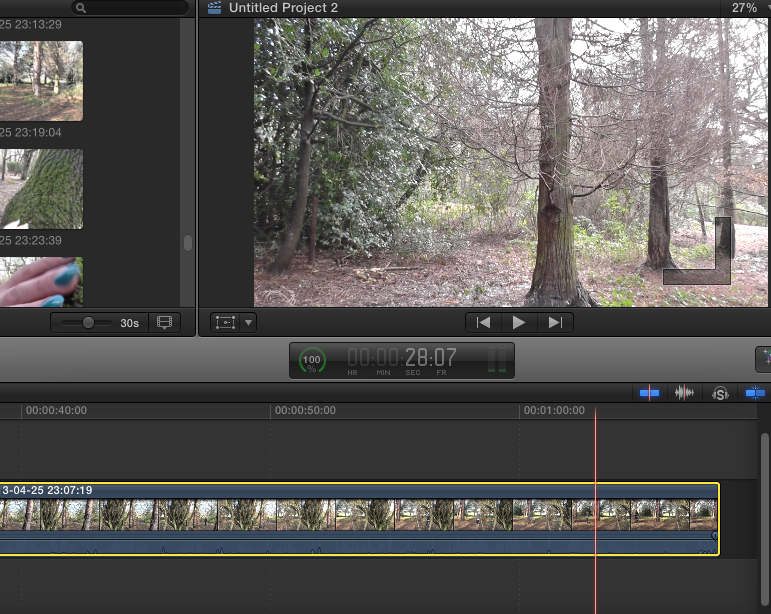
Cutting off the parts we do not need;
Today's editing lesson has been useful for helping to improve our editing skills, we have decided which parts we need and which parts we won't be using. This is good because we will not have any unnecessary footage and this means our work will run smoothly and the editing will work well.
Adding in the footage that we need, ensuring it is in chronological order;
Deciding where we need to cut off parts of the clip we do not need;

Cutting off the parts we do not need;
Today's editing lesson has been useful for helping to improve our editing skills, we have decided which parts we need and which parts we won't be using. This is good because we will not have any unnecessary footage and this means our work will run smoothly and the editing will work well.
Monday, 17 March 2014
Filming
During the filming process, we took some pictures of our filming in action. I have embedded the collage below that I created on a website called Fotor. Here we are at Bentley Priory nature reserve in harrow. Everyone in our group had an active role; for example I did the filming, Simran directed us and came up with some ideas for camera angles, and Amy accurately depicted our character as a vulnerable teenage girl.
Thursday, 13 March 2014
Pre-Filming activities
Canted angle test footage:
Before we started filming, we decided we should experiment with camera filming, and some of the angles we could use, to create the greatest impact. The angle we experimented with, is a canted angle from the floor, because we thought this looked effective, when introducing a character, which is conventional in the openings of horror films. Therefore we did a test shot, to see if it was realistic, and if it worked as well as we hoped.
Editing:
Using Final Cut Pro, we tested some filters, to change the lighting and experiment with what looks more like a horror film, as dark lighting is conventional for horror films. The filter we found looked best is called 'Isolate', we liked this filter the best, because it made the footage slightly darker, and this tint to the lighting looked as though it created a dark, gloomy and spooky atmosphere.
Below are some screenshots from the editing process;
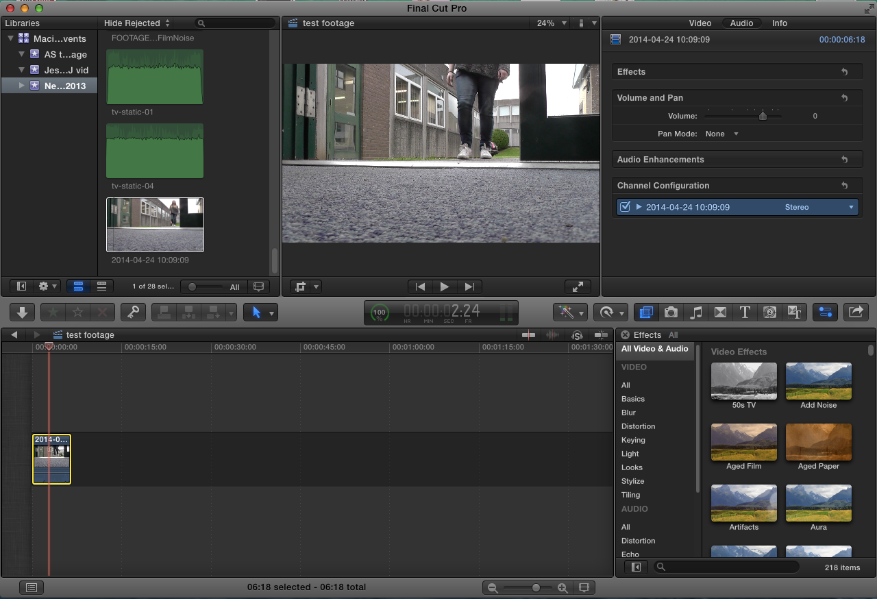
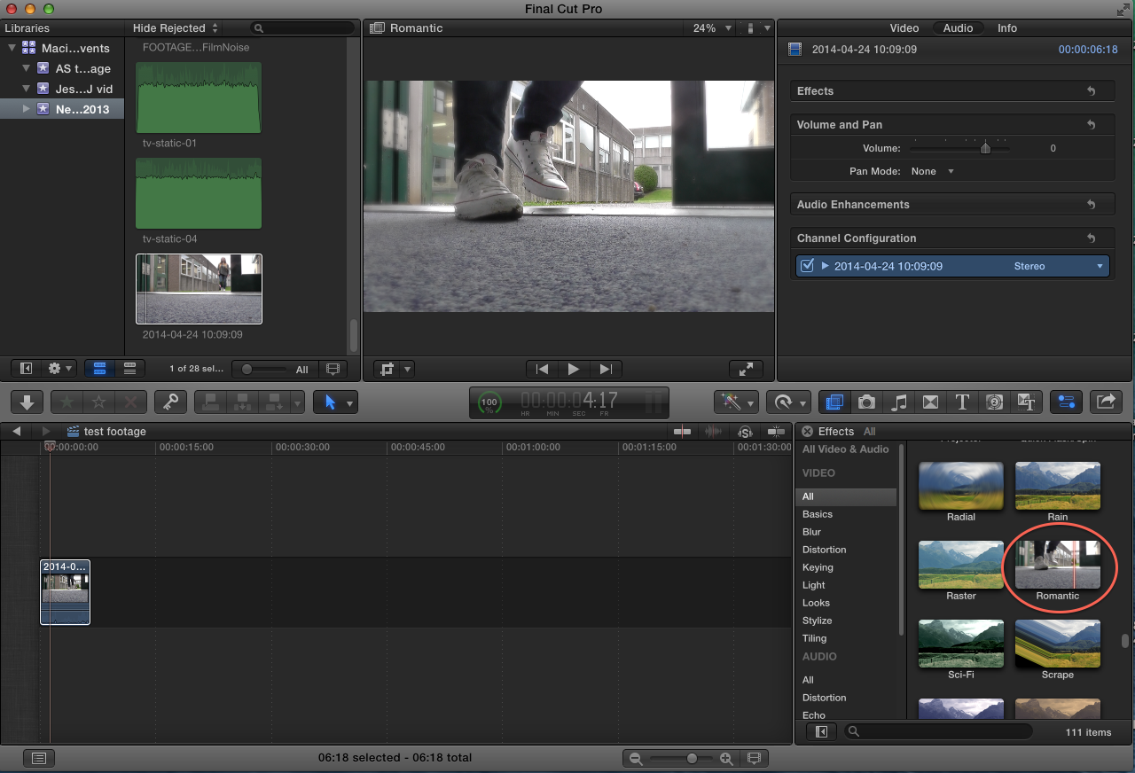
The next filter we experimented with that we felt looked good, is called 'Romantic' as it adds a slight blur to the footage, which connotes dizziness and haziness. We could use this effect to make it seem as though the character is unsure as to her surroundings or what is happening, which would be a good effect to have for a horror film.
Audio:
Also we experimented with some sound effects, to put emphasis on the footsteps, the two sound filters we chose to look at are called 'Cathedral' and 'Delay Designer'. These two sound filters combined enhanced the natural sound of nature, and the footsteps, this draws focus to the character's entrance, we may consider this in our final project.
Edited test footage:
Before we started filming, we decided we should experiment with camera filming, and some of the angles we could use, to create the greatest impact. The angle we experimented with, is a canted angle from the floor, because we thought this looked effective, when introducing a character, which is conventional in the openings of horror films. Therefore we did a test shot, to see if it was realistic, and if it worked as well as we hoped.
Editing:
Using Final Cut Pro, we tested some filters, to change the lighting and experiment with what looks more like a horror film, as dark lighting is conventional for horror films. The filter we found looked best is called 'Isolate', we liked this filter the best, because it made the footage slightly darker, and this tint to the lighting looked as though it created a dark, gloomy and spooky atmosphere.
Below are some screenshots from the editing process;

The next filter we experimented with that we felt looked good, is called 'Romantic' as it adds a slight blur to the footage, which connotes dizziness and haziness. We could use this effect to make it seem as though the character is unsure as to her surroundings or what is happening, which would be a good effect to have for a horror film.

Audio:
Also we experimented with some sound effects, to put emphasis on the footsteps, the two sound filters we chose to look at are called 'Cathedral' and 'Delay Designer'. These two sound filters combined enhanced the natural sound of nature, and the footsteps, this draws focus to the character's entrance, we may consider this in our final project.
Edited test footage:
Friday, 7 March 2014
Health and Safety form
Embedded above is a health and safety risk assessment, that I have produced through a website called SlideShare. This was created because it is important that we understand the risks and dangers we should be aware of whilst filming, by being aware of any dangers, our group will be able to complete the filming process smoothly with fewer complications.
Wednesday, 5 March 2014
Research and Planning
Storyboard:
Again using the website FlipSnack I have created an album that shows our storyboard planning. We came together to discuss some ideas and plan out what we want to do. We also discussed the conventions we could include, and some of the ones we should avoid, to avoid looking too cliched. Simran then drew out the storyboard, which gave us a better idea of the reality of our ideas. Planning a storyboard has been useful, as it has been a good way for us to have some ideas prior to filming, also we have something to follow, to ensure we remember to include everything. Using a storyboard will impact our final video, as we will be able to begin smoothly without wasting time.
Shotlist:
Embedded below is a shotlist that was created by group member Amy Smith, she created a shotlist using a website called SlideShare. It is important that we have a shotlist before we begin filming, because it allows us to follow our original ideas, and ensures that we have variation in our final film, which is important because it means our final video will look realistic and professional.
Subscribe to:
Comments (Atom)


