Editing stage three
As we come to the end of our editing, little things must be added to create a good overall product, for example the credits had be added, it is key that we use a font that fits with the horror genre, and select a colour that fits in with conventional horror film colour schemes. Below are screen shots of our selection process in deciding what font we will use,
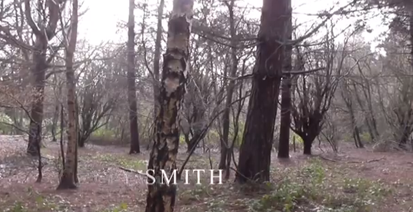
- The name of the titles that we decided looked the best is 'Feature' we chose this because the font fades in and out, leaving a eerie spooky atmosphere. Here we are placing it onto the footage and positioning it somewhere that looks best.
- This screenshot shows the titles fading in, this looks good as the simplistic white font that fades in and out has connotations of ghosts and spirits, which is very much linked with the horror genre.
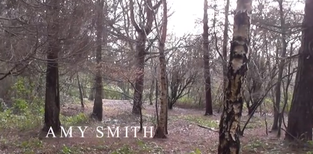
- This screenshot shows the font we titles we have chosen fully, as can be seen it is a simplistic font, that has not too much detail, and the letters are all in capitals, suggesting this is serious film, and the mysterious atmosphere has been set.

No comments:
Post a Comment