Looking back at your preliminary task, what do you feel you have learnt in the progression from it to the full product?
To answer this question, I have created a slideshow, using the website SlideShare. This slideshow demonstrates how my group and I have progressed from our preliminary task, to our final video.
Friday, 4 April 2014
Thursday, 3 April 2014
Evaluation - Question Six
What have you learnt about technologies from the process of constructing this product?
This part of the evaluation was answered by Simran Takhar, and she has created a timeline using a website called TimeToast, the work she produced is embedded below.
This part of the evaluation was answered by Simran Takhar, and she has created a timeline using a website called TimeToast, the work she produced is embedded below.
Wednesday, 2 April 2014
Evaluation - Question Five
How did you attract/address your audience?
My group member Amy has answered this part of the evaluation, she has used a website called Kioza to answer it. Below is her work that she has completed in order to answer this question.
Kizoa slideshow: evaluation - Slideshow
Amy has also used the annotation tool on YouTube to highlight how we have specifically tried to address and attract our audience to opening titles and sequence, the video is embedded below.
Evaluation - Question Four
Who would be the audience for your media product?
This part of the evaluations as answered by Simran Takhar, she has created an animation to demonstrate the kind of people that are part of our audiences. The videos she created are embedded below.
Our film would appeal to Emma because she has an interest in murder mystery/crime tv shows which can be similar to psychological thrillers and horror films . Also Emma is a teenage girl with a clear liking for horror films and so she would probably look forward to watching my groups film 'The Perpetrator' in cinemas, because the leading actress in our film is a teenage girl from London. Taking note of this Emma may be appealed to watch our film because she finds the leading actress similar to her, related to the uses and gratifications model; she would find our media text appealing because it personally appeals to her and presents her with a role model/ someone she can look up to. Furthermore, 'The Perpetrator' is similar and in the same genre of some of her favorite films. So our film would easily appeal to her. It can be noted that my groups target audience questionnaire results have also made it clear that a girl in Emma's age range like our ideal target audience.
Tuesday, 1 April 2014
Evaluation - Question two
How does your media product represent particular social groups?
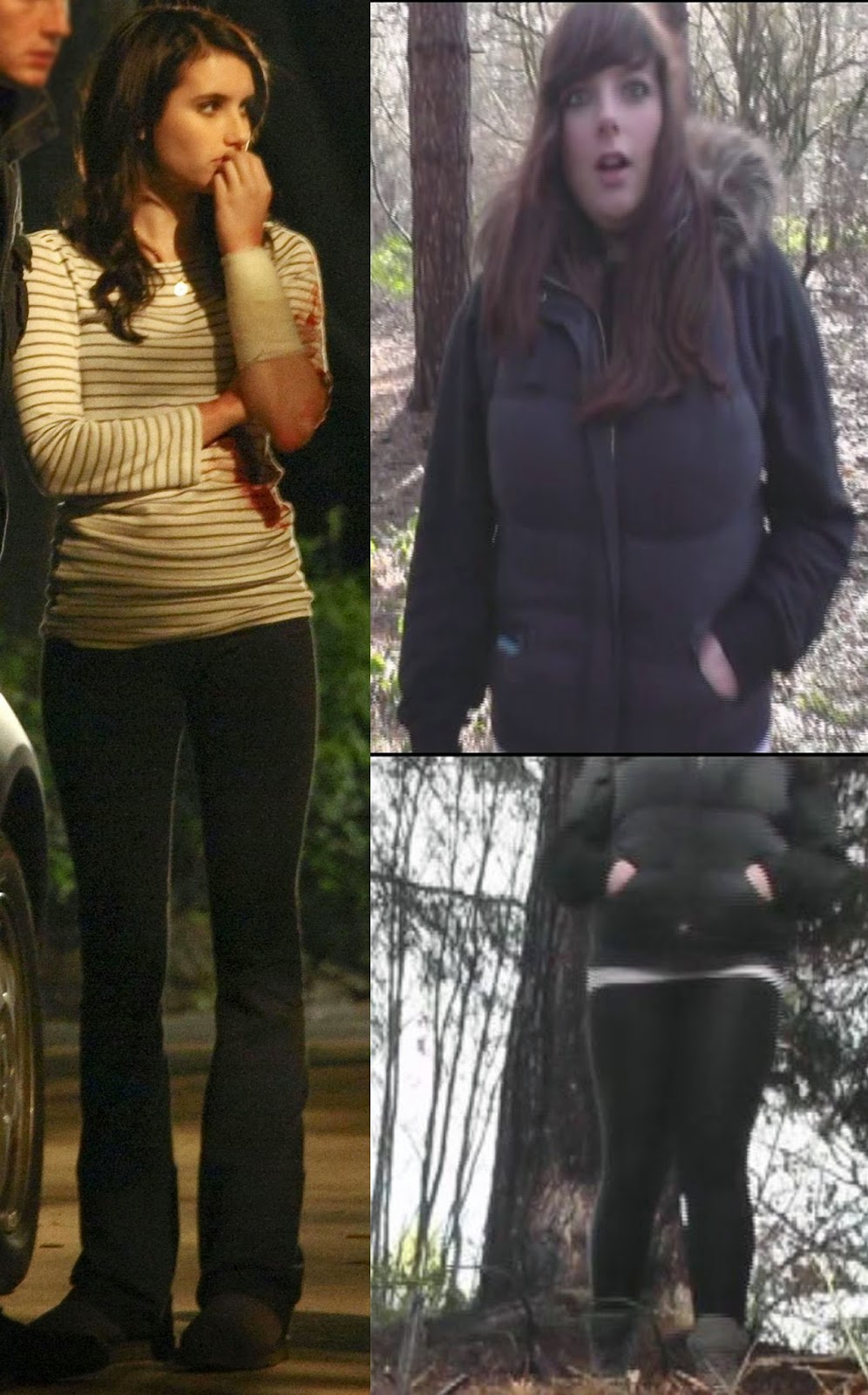 Our sequence 'The Perpetrator' mainly depicts young teenage girls, we have chosen to use this particular social group because young teenage girls are stereotypically quite naive and oblivious to dangerous situations. This is ideal for horror films as there is already some kind of danger, which created a greater thrill for the audience.
To the left is a collage I have created using Photoshop, I have chosen to compare our main character with 'Jill' from Scream 4. 'Jill' is a prime example of how characters are denoted, so I have created a character for our horror film, that was widely influenced from 'Jill' from Scream 4.
Both characters are attired similarly, they both wear subtle clothing, that does not attract attention, this connotes that they are simplistic and oblivious to any danger that may befall them. Both 'Jill' and our character take the role of the victim in their horror films, which could be as a result of their oblivion to danger and their simplistic view of life.
However 'Jill' is filming this scene in the night, which is slightly more conventional for a horror film, however when we were filming, we discovered that night time filming was impractical as it was not entirely clear what was happening. Therefore we have done our filming in daylight, where it is clear and coherent what is happening.
All in all the elements listed above help to represent a normal social group, my groups final film project also aims to represent this social collective. The teenage actor in our final project looks like a normal everyday teenager - wearing casual clothing and acting like most teenagers do, doing nothing out of the ordinary or anything out of character for a teenager in today's day and age.
Our sequence 'The Perpetrator' mainly depicts young teenage girls, we have chosen to use this particular social group because young teenage girls are stereotypically quite naive and oblivious to dangerous situations. This is ideal for horror films as there is already some kind of danger, which created a greater thrill for the audience.To the left is a collage I have created using Photoshop, I have chosen to compare our main character with 'Jill' from Scream 4. 'Jill' is a prime example of how characters are denoted, so I have created a character for our horror film, that was widely influenced from 'Jill' from Scream 4.
Both characters are attired similarly, they both wear subtle clothing, that does not attract attention, this connotes that they are simplistic and oblivious to any danger that may befall them. Both 'Jill' and our character take the role of the victim in their horror films, which could be as a result of their oblivion to danger and their simplistic view of life.
However 'Jill' is filming this scene in the night, which is slightly more conventional for a horror film, however when we were filming, we discovered that night time filming was impractical as it was not entirely clear what was happening. Therefore we have done our filming in daylight, where it is clear and coherent what is happening.
All in all the elements listed above help to represent a normal social group, my groups final film project also aims to represent this social collective. The teenage actor in our final project looks like a normal everyday teenager - wearing casual clothing and acting like most teenagers do, doing nothing out of the ordinary or anything out of character for a teenager in today's day and age.
Evaluation - Question three
What kind of media institution might distribute your media product and why?
This part of the evaluation was answered by group member Amy Smith, to answer this she has used a website called Bubbl, which is embedded below.
This part of the evaluation was answered by group member Amy Smith, to answer this she has used a website called Bubbl, which is embedded below.
Evaluation - Question one
1. In what ways does your media product use, develop or challenge forms and conventions of real media products?
This part of the evaluation was answered by group member Simran Takhar, she has created a contact sheet using Photoshop that features stills from our opening sequence. Embedded below is her answer to this question.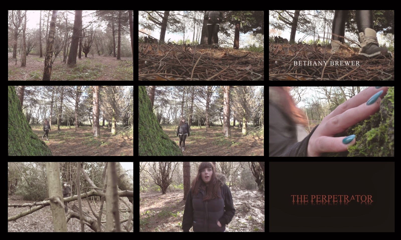
The first frame denotes the location/setting in our film. It is a slow panning shot, acting as an establishing shot. From this shot it becomes clear to viewers that the film is set in an abandoned forest, a conventional setting of the horror film. Shots like this are typical in film openings as they grab viewers attention and help to create a mood for the overall film. In this case the slow paced shot creates an eerie mood
The main character Amy, in this scene, is introduced in our second shot. Like most conventional film openings the main character(s) in the film are introduced in the opening sequence. We have used a low angle shot to introduce Amy, as she walks towards and past the camera, into the forest.
The title font is shown in the third frame. and it looks quite bold and eye catching. My group chose to use a simplistic font because in horror titles the fonts aren't usually over styled. We gave our white titles font a glow and shadow making it seem ghostly
 connoting that our films narrative explores people dying. In horror films it's conventional for title fonts to reflect the story line of the whole film. For example in 'The Cabin In The Woods' the titles font looks like dripping blood, connoting that the film has a dangerous/violent story line.
The fourth image in the contact sheet highlights how our opening sequence suggests the genre of our film. This is another conventional feature of film openings. We have made it clear that our genre is horror by using an isolated forest, creating a tense mood. Also Amy,our main character, is young and blind to the dangers around her another stereotypical feature in horror films. Furthermore, this camera angle suggests that someone is watching Amy from afar, connoting that she could be in great danger in the next few scenes of the film.
Costume and props are denoted in this image. Amy, is denoted in the frame wearing leggings, a hooded body warmer, a black jumper and a plain white t shirt. Her whole outfit follows the stereotypical representation of teenagers, as she is wearing informal clothing. Also her hoodie is a piece of iconography associated with teenagers.
Camera work and editing is denoted in the next frame. My group have used a match on action editing technique in this part of the film. It's quite conventional for this techniques to be used in all genre films.
My group has used special effects in this frame. We put a tinted filter onto this frame, to make it seem like Amy is being looked at from another characters perspective. This is also connoted by the framing of this shot as Amy is being observed through tree branches, connoting that someone is secretly watching her. We also used a hand held filming effect in this part of the film to make it look like a point of view shot.
The story builds up as the opening sequence progresses. Amy is last seen on screen looking shocked and frightened, leaving viewers wondering what will happen next. This sets the story of the film up and suggests that someone of great danger is in Amy's town. To keep our titles conventional we decided to keep them slow paced and not have too much action in them, as this would go against typical film titles. Similar to films like 'Scream' Amy's story is building up to the main story in the film and we have tried to draw inspiration from Saw where one of the various characters in the film is killed off in the opening.
The last image on our contact sheet is of the main title in our opening. We decided to have the main title at the end of our opening sequence as it has a dramatic entrance and leaves a cliff hanger as to how the story will further unfold in the film. It's also conventional for the title to be after the opening sequence in the film in some horror films, as seen in the video below from Scream 4. My group chose the title 'The Perpetrator' because it means "someone who commits a crime or evil". The title reflects the horror genre. It also relates to the story line in our film where a serial killer is on the lose.
This part of the evaluation was answered by group member Simran Takhar, she has created a contact sheet using Photoshop that features stills from our opening sequence. Embedded below is her answer to this question.
The video above is related to the points made about stills 8 and 9
Overall, my groups opening sequence and titles are meant to be conventional of the horror genre.
Thursday, 27 March 2014
Final Titles
Embedded below is my groups final titles. The roles we took included acting - by Amy Smith, and directing/producing - Simran Takhar and filming was done by myself.
Thursday, 20 March 2014
Editing stage three
As we come to the end of our editing, little things must be added to create a good overall product, for example the credits had be added, it is key that we use a font that fits with the horror genre, and select a colour that fits in with conventional horror film colour schemes. Below are screen shots of our selection process in deciding what font we will use,

- The name of the titles that we decided looked the best is 'Feature' we chose this because the font fades in and out, leaving a eerie spooky atmosphere. Here we are placing it onto the footage and positioning it somewhere that looks best.
- This screenshot shows the titles fading in, this looks good as the simplistic white font that fades in and out has connotations of ghosts and spirits, which is very much linked with the horror genre.
- This screenshot shows the font we titles we have chosen fully, as can be seen it is a simplistic font, that has not too much detail, and the letters are all in capitals, suggesting this is serious film, and the mysterious atmosphere has been set.
Wednesday, 19 March 2014
Editing stage two
As we are about half way through editing, we have decided to start looking at some copyright free music we may add to our film, to create suspense. The music we are looking at comes from a website called SoundCrate.

Below is a screenshot of the music we are using in our film, being added to our footage to see how well they work together.

This activity was good for the progression of our horror film, because it gave our group a better indication of what kind of music will work with our footage and what kind of music will not. This will impact our final video because we will have music that flows with the timing, pace and atmosphere of our horror film.
Below is a screenshot of the music we are using in our film, being added to our footage to see how well they work together.
This activity was good for the progression of our horror film, because it gave our group a better indication of what kind of music will work with our footage and what kind of music will not. This will impact our final video because we will have music that flows with the timing, pace and atmosphere of our horror film.
Tuesday, 18 March 2014
Editing stage one
Today we have started editing our footage, so far we have put a few shots in and we have started cutting off excess parts of the clip that we don't need to use. Below are the screen shots of some of the editing stages.
Adding in the footage that we need, ensuring it is in chronological order;

Deciding where we need to cut off parts of the clip we do not need;
Cutting off the parts we do not need;

Today's editing lesson has been useful for helping to improve our editing skills, we have decided which parts we need and which parts we won't be using. This is good because we will not have any unnecessary footage and this means our work will run smoothly and the editing will work well.
Adding in the footage that we need, ensuring it is in chronological order;
Deciding where we need to cut off parts of the clip we do not need;
Cutting off the parts we do not need;
Today's editing lesson has been useful for helping to improve our editing skills, we have decided which parts we need and which parts we won't be using. This is good because we will not have any unnecessary footage and this means our work will run smoothly and the editing will work well.
Monday, 17 March 2014
Filming
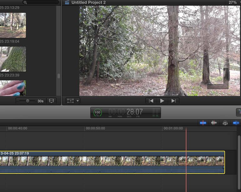
During the filming process, we took some pictures of our filming in action. I have embedded the collage below that I created on a website called Fotor. Here we are at Bentley Priory nature reserve in harrow. Everyone in our group had an active role; for example I did the filming, Simran directed us and came up with some ideas for camera angles, and Amy accurately depicted our character as a vulnerable teenage girl.

Thursday, 13 March 2014
Pre-Filming activities
Canted angle test footage:
Before we started filming, we decided we should experiment with camera filming, and some of the angles we could use, to create the greatest impact. The angle we experimented with, is a canted angle from the floor, because we thought this looked effective, when introducing a character, which is conventional in the openings of horror films. Therefore we did a test shot, to see if it was realistic, and if it worked as well as we hoped.
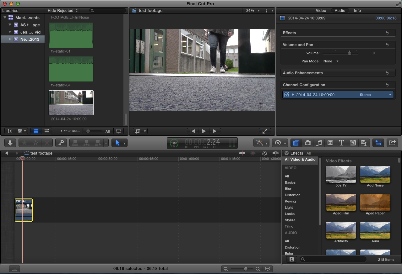
Editing:
Using Final Cut Pro, we tested some filters, to change the lighting and experiment with what looks more like a horror film, as dark lighting is conventional for horror films. The filter we found looked best is called 'Isolate', we liked this filter the best, because it made the footage slightly darker, and this tint to the lighting looked as though it created a dark, gloomy and spooky atmosphere.
Below are some screenshots from the editing process;

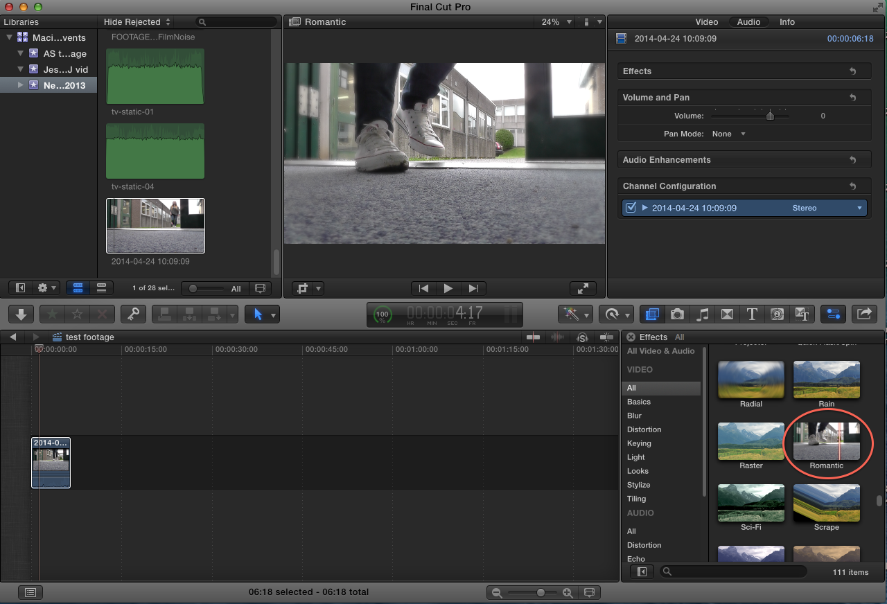
The next filter we experimented with that we felt looked good, is called 'Romantic' as it adds a slight blur to the footage, which connotes dizziness and haziness. We could use this effect to make it seem as though the character is unsure as to her surroundings or what is happening, which would be a good effect to have for a horror film.
Audio:
Also we experimented with some sound effects, to put emphasis on the footsteps, the two sound filters we chose to look at are called 'Cathedral' and 'Delay Designer'. These two sound filters combined enhanced the natural sound of nature, and the footsteps, this draws focus to the character's entrance, we may consider this in our final project.

Edited test footage:
Before we started filming, we decided we should experiment with camera filming, and some of the angles we could use, to create the greatest impact. The angle we experimented with, is a canted angle from the floor, because we thought this looked effective, when introducing a character, which is conventional in the openings of horror films. Therefore we did a test shot, to see if it was realistic, and if it worked as well as we hoped.
Editing:
Using Final Cut Pro, we tested some filters, to change the lighting and experiment with what looks more like a horror film, as dark lighting is conventional for horror films. The filter we found looked best is called 'Isolate', we liked this filter the best, because it made the footage slightly darker, and this tint to the lighting looked as though it created a dark, gloomy and spooky atmosphere.
Below are some screenshots from the editing process;
The next filter we experimented with that we felt looked good, is called 'Romantic' as it adds a slight blur to the footage, which connotes dizziness and haziness. We could use this effect to make it seem as though the character is unsure as to her surroundings or what is happening, which would be a good effect to have for a horror film.
Audio:
Also we experimented with some sound effects, to put emphasis on the footsteps, the two sound filters we chose to look at are called 'Cathedral' and 'Delay Designer'. These two sound filters combined enhanced the natural sound of nature, and the footsteps, this draws focus to the character's entrance, we may consider this in our final project.
Edited test footage:
Friday, 7 March 2014
Health and Safety form
Embedded above is a health and safety risk assessment, that I have produced through a website called SlideShare. This was created because it is important that we understand the risks and dangers we should be aware of whilst filming, by being aware of any dangers, our group will be able to complete the filming process smoothly with fewer complications.
Wednesday, 5 March 2014
Research and Planning
Storyboard:
Again using the website FlipSnack I have created an album that shows our storyboard planning. We came together to discuss some ideas and plan out what we want to do. We also discussed the conventions we could include, and some of the ones we should avoid, to avoid looking too cliched. Simran then drew out the storyboard, which gave us a better idea of the reality of our ideas. Planning a storyboard has been useful, as it has been a good way for us to have some ideas prior to filming, also we have something to follow, to ensure we remember to include everything. Using a storyboard will impact our final video, as we will be able to begin smoothly without wasting time.
Shotlist:
Embedded below is a shotlist that was created by group member Amy Smith, she created a shotlist using a website called SlideShare. It is important that we have a shotlist before we begin filming, because it allows us to follow our original ideas, and ensures that we have variation in our final film, which is important because it means our final video will look realistic and professional.
Thursday, 27 February 2014
Costume

We chose for her to wear a costume that accurately represents her conventionally as a young teenage girl. The clothes are all dark, as this connotes that the the character is not going somewhere safe, as darkness is associated with danger.
Also the clothing in itself is typical conventional for teenagers, for example, leggings are often seen on teenagers and therefore leggings are some iconography related to teenage girls.
The clothes are however, quite practical, which suggests that should our character come across danger she will be able to put up some kind of defence. This subverts stereotypes, as usually females in horror films are dressed impractically, which adds to the idea that they are a 'Damsel in Distress' and they need to be saved. As our character is not represented as though she is particularly vulnerable, this may create an enigma, as the audience are unsure as to whether this will be a stereotypical horror film, making our horror more enticing.
Monday, 24 February 2014
Bentley Priory Location Shots
I have created an album of pictures from Bentley Priory, a nature reserve where we would like to do some filming, using a website called FlipSnack. This location is ideal for the filming of a horror film as the location is isolated, quite darkly lit, and very quiet. This means that we will be able to create an opening to a horror film, that complies with many of the conventions, as many of the conventions include an isolated place, that offers minimal salvation. For example; 'Cabin In The Woods' has a dark, isolated setting.
Monday, 10 February 2014
Final Project Idents
To create our own Idents, as a group we came up with a storyboard to follow so that we could consider how our Idents will appear on screen. Creating a storyboard helped us to decide whether our ideas will be realistic or if they will look professionally done. Below are pictures of the storyboard we created for our Idents.


Final Idents:
Above is the Ident that we created for our final project, we created two Idents using Final Cut Pro, as we decided that it was more conventional of horror movies to use two Idents. The first Ident is a more generic one, that is a presentation of the larger production company, and the second Ident is one that is subject to horror films, perhaps a company that only produces horror film.
First Ident:
The first, more generic Ident makes use of clouds, as this seems to be a convention in Idents, for example Lionsgate, Dreamworks, Paramount, TriStar and Columbia all use clouds and skies in their Idents. This is because clouds have connotations of holding water, similar to the eye, which implies that these films will provoke an emotional response from the audiences.

.jpg)
Second Ident:
Our second Ident is subject to horror films. The title of 'Eerie Entertainment' should suggest that this is a smaller production company, that specialises in horror films, also the Ident makes use of a black and red colour scheme, which has the connotations of blood, darkness and horror. This is conventional of horror films, because it can also be seen in other smaller production company's Idents to horror films. For example; 'Revolt' and 'Red Letter'.

The footage, and soundtracks used for our Idents were taken from a copyright free and royalty free website called Footage Crate/Sound Crate.
Above is the Ident that we created for our final project, we created two Idents using Final Cut Pro, as we decided that it was more conventional of horror movies to use two Idents. The first Ident is a more generic one, that is a presentation of the larger production company, and the second Ident is one that is subject to horror films, perhaps a company that only produces horror film.
First Ident:
The first, more generic Ident makes use of clouds, as this seems to be a convention in Idents, for example Lionsgate, Dreamworks, Paramount, TriStar and Columbia all use clouds and skies in their Idents. This is because clouds have connotations of holding water, similar to the eye, which implies that these films will provoke an emotional response from the audiences.
Second Ident:
Our second Ident is subject to horror films. The title of 'Eerie Entertainment' should suggest that this is a smaller production company, that specialises in horror films, also the Ident makes use of a black and red colour scheme, which has the connotations of blood, darkness and horror. This is conventional of horror films, because it can also be seen in other smaller production company's Idents to horror films. For example; 'Revolt' and 'Red Letter'.
The footage, and soundtracks used for our Idents were taken from a copyright free and royalty free website called Footage Crate/Sound Crate.
Tuesday, 4 February 2014
Idents Research
Today's task was to look at Idents in more detail. An Ident is something that identifies film production companies, and they're usually shown at the beginning of the film. An Ident may be used to introduce the genre of the film, and create an image of the mood of the film. Idents may be used to add to the 'Cinema Experience' as in cinemas Idents are indicative that the film is starting, and it builds the dramatic tension before the film. We have looked into some production companies and looked at their Idents that are quite well known. In some detail we have looked at 'Lionsgate' and 'Dreamworks'. We have chosen to look at these as they are from generally different genres, so the similarities and differences are somewhat interesting.
Lionsgate:
Below is one out of the two Lionsgate Idents I will be looking at. Lionsgate are known for many horror films, and their Ident must reflect this, the embedded Ident is quite low key, the lighting is dark and the music begins slow paced, as it slowly creeps up and with this, so does the lighting. As it comes to an end, the music fades and the image with the font saying 'LIONSGATE' fades to black, leaving a serious impression on the audience.
Design and Intention:
The Ident is frequently used by Lionsgate, and it has a duration of 22 seconds. To begin with the Ident presents machinery, such as clogs and gears, connoting that similarly to machinery, 'Lionsgate' keep the film industry working and functioning. This may be due to their established name, and their reputation for a big production company. The camera zooms out of the clogs and gears as we pan out through the view of a keyhole, as the camera continues to zoom out. We soon see two quite prestige doors opening, which shows some lighter lighting, as we see the word 'Lionsgate' spread across clouds in a simple yet bold font, which reinforces the idea that 'Lionsgate' are a prestige as they images they have used have many connotations. For example, the doors 'opening up' could be indicative of the spectators minds as they are watching the film, being 'open' to a film that is a new experience to them. Also clouds have connotations of heaven, which may be suggestive of the high quality of the film that is to follow.
Another Ident that belongs to 'Lionsgate' that can be found is shown below;
Design and Intention:
This Ident is subject to films that are more to the genre of horror and gore. The colour scheme used is more dark and red, which connotes danger, blood, violence and slasher. This can be seen as a reflection of the genre. The opening is similar to the one above, with a close up of clogs and gears and panning and moving around them. However the cogs are more red and rusty than before, the doors also seen heavier and darker which again differs from the first. Similarly to the first Ident, this one lasts 22 seconds also. However as the doors open, the clods are deep red, and the font is black, with a hint of a rusty red. The font is still capital, so the image is still serious and dramatic, yet the collective image seems more subject to horror films. In contrast to the first Ident, the use of red clouds may connote hell as opposed to heaven. The doors used in this one are also less prestige, which again connotes that the film following may not be as lavish, as one perhaps following the previous Ident.
Dreamworks
'Dreamworks' are generally known for their films that are often animated and/or comedies. However 'Dreamworks' are known to be seen as the production companies to horror films such as "The Ring".
Below is one of the two Idents I will be looking at from 'Dreamworks'.
Design and intention:
This Ident lasts for 28 seconds, and is probably the most recognisable from the 'Dreamworks' Idents. The sequence denotes the reflection of a moon in water, which is soon interrupted by fishing bait in dropping into the water. As we pan up we go through the clouds and above them to the actual image of the moon with a young boy sitting in the curve of the moon, which soon turns into the curve on the 'D' at the beginning of Dreamworks. Throughout there is uplifting enchanting music, that helps to create the mood of the film. Then the camera pans to the right as we follow the word 'Dreamworks' through misty clouds. Finally there is a last shot of the word 'Dreamworks', quite zoomed out that is surrounded by clouds. The use of a child at the beginning of the Ident may connote that dreams are associated with children, creating a sense of nostalgia. Dreamworks may have chosen to do this, to make it seem as though their films are imaginative, as the colour scheme of blue and white is associated with clouds and the sky, and imaginative dreams and thoughts.
Below is an Ident from 'Dreamworks' that was created for The Ring (2002).
Design and intention :
The design is somewhat similar to the previous one shown. The main differences being that this Ident is shorter, lasting for 21 seconds, also this one has a lack of music, there are small bursts of white noise, that matches the small bursts of static during the Ident, which matches the image of the film, as the film is based around a VCR that has static. This is useful for indicating the tone of the film, and giving the audience an insight as to what the film may be about.
This research will be useful when it comes to the creation of our own Idents, as we will have a greater understanding of the ways in which an Ident can create the mood of a film, also the imagery used in the Idents can connote some of the themes that could be found in the film.
Thursday, 16 January 2014
Horror Film Step Outlines
In order for us to create good opening credits, that are realistic and fit in with our genre, we had the task to look into some of the opening titles to established horror films. The first one that we looked at is the first two minutes of Cabin In The Woods. Below is a slideshare of the analysis that Simran and I created when looking at Cabin In The Woods.
This activity has been useful, as it has shown us some of the conventions that are used in the opening two minutes of horror films, including, the kind of music used, and how quickly the film introduces the narrative. This will be influential when we create our opening titles to our horror film.
Monday, 6 January 2014
Film pitch, Padlet and Amendments
Above is the Film Pitch, detailing our ideas as a group for our opening titles. We have included a synopsis for the narrative, a resource list and a locations list needed in our film, also there is some information on the title of our film and its genre. Simran has created a slideshare, to depict our ideas in an interesting and creative way.
We needed feedback on our ideas, so that we could determine if our ideas were along the right lines, or if they needed any adjustments. Any feedback on our ideas will be useful and important, as comments from our peers will be hugely influential when we create our horror film, as we will know we area meeting our target audiences needs. Below is the embedded pad let, with the What Went Well comments, and some Even Better If... comments.
The feedback from our Padlet has taught us that we need to change some of the original ideas we had:
- We need to avoid trying to fit too much of the narrative into the opening of the film, as it wouldn't be conventional and in reality the start of the films don't include a great deal of the narrative in them straight away.
- In our draft treatment we made a mistake with our films name and this error was pointed out by our peers, we mistakingly named it 'The Protagonist' but it's meant to be called 'The Perpetrator', so we need to ensure we change the name.
- Also one of my peers suggested that we make sure that the actor playing the 'Perpetrator' acts realistically, this could be difficult to film and so we decided to have the 'Perpetrators' perspective filmed from some shaky point of view shots.
Subscribe to:
Comments (Atom)